2by2.se recently got a completely new look when the site was re-launched, close to three years after its initial launch. The new site focused clearly around presenting the insights that are published by 2by2 on a regular basis. In addition, information about the company and news will be made available.
One of the key features of the new site, and the driver behind the change, is the implementation of responsive design. More and more mobile devices of different shapes and forms are used to consume media, and responsive design makes sure to adapt size and structure of site in order to improve use experience also for mobile devices.
Hope you will enjoy the new look and feel of 2by2.se!
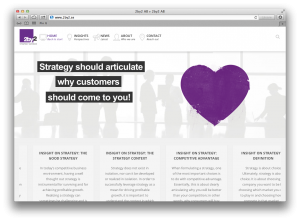
Below if a screenshot that shows how the site will look like if you view it from an ordinary desktop or laptop.

Below is a screenshot that show how the site will look like if you access it with a iPad.
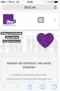
And finally, below is a screenshot that shows how 2by2.se will look like when you access it with an iPhone.
Leave A Comment